Why Do Some Colored Contact Lenses Look Fake? The Science of Natural vs. Unnatural Lens Designs
Picture this: a customer tries on a pair of colored contact lenses recommended by your brand. She looks in the mirror and immediately notices something’s off. Her eyes look… different. Not better. Just different. Like someone pasted two colored circles over her natural iris without any consideration for how her eyes actually work.
That’s the moment you lose a customer. Not because the lenses are uncomfortable. Not because they’re poorly made. But because they look fake. And in the colored contact lens business, looking fake is the fastest way to kill a brand’s reputation.
But here’s what most brand owners don’t realize: the difference between “natural” and “fake-looking” isn’t random. It’s not just about picking the right color. It’s about understanding the optical science behind how colored lenses interact with the human eye. And if you’re building a private label line, this knowledge should drive every design decision you make.
The Problem Starts with Flat Color Design
The biggest mistake we see in entry-level colored lenses is treating the iris like a flat surface that needs to be painted over. Single-tone lenses—where the entire visible area is one uniform color—are the most common culprit.
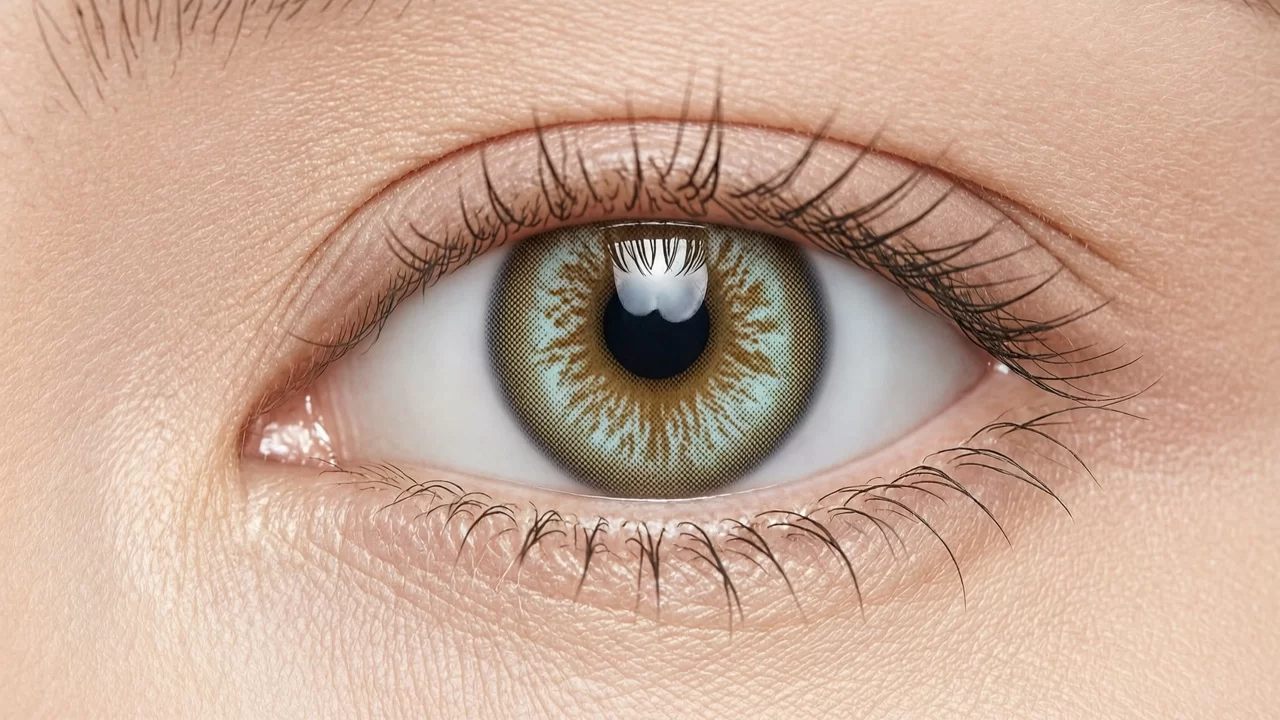
Think about a real human iris for a moment. It’s not one color. It’s a complex structure with multiple layers, patterns, and depth. There’s the inner ring near the pupil, the mid-zone with its unique patterns, and the outer limbal ring that creates definition. Real irises have variations, spots, radial fibers, and subtle shifts in saturation.
When you put a flat, single-color lens over that natural complexity, you’re essentially erasing all the depth cues that make an eye look alive. The result is what people describe as “doll eyes” or “fake eyes”—technically colored, but visually dead.
This is why the most successful colored lens brands in 2026 are moving away from single-tone designs entirely. They’re investing in multi-layer patterns that mimic the natural structure of the iris. And the technology to produce these designs has become far more accessible than it was even two years ago.
Understanding the Three-Layer Approach
Modern natural-looking colored lenses typically use what the industry calls a “sandwich” or multi-layer printing approach. But it’s not just about stacking colors. Each layer serves a specific optical purpose.
The inner layer (closest to the eye) usually provides the base tint. This is where you establish the fundamental color shift—say, from dark brown to honey brown. This layer needs to be semi-transparent, not opaque, so the wearer’s natural iris color can influence the final result. That’s why the same lens can look slightly different on different people—and why that’s actually a good thing. It means the lens is working with the natural eye, not against it.
The middle layer is where the pattern lives. This is the most critical layer for creating a natural appearance. Instead of a solid fill, this layer contains the iris-like patterns: radial lines, crypts (the small pockets you see in real irises), and color variations. High-quality lenses use patterns derived from actual iris scans, not just random artistic designs.
The outer layer defines the limbal ring—the darker ring at the edge of the iris that gives eyes their definition. A well-designed limbal ring makes eyes look larger and more defined without looking obviously enhanced. The trick is subtlety: the ring should be soft-edged, not a hard circle, and its color should harmonize with the mid-zone pattern rather than contrast sharply with it.
Why Transparency Matters More Than Opacity
Here’s a counterintuitive truth about colored contact lenses: the ones that look most natural are often the ones that provide the least dramatic color change.
Let me explain. When a lens is highly opaque, it completely blocks the wearer’s natural iris color. That sounds like a feature—after all, customers want their eyes to look different, right? But complete opacity creates a flat, uniform appearance because there’s no interaction between the lens color and the underlying iris structure.
Semi-transparent lenses, on the other hand, allow the natural iris to show through. This creates depth and variation that the human eye instinctively recognizes as “real.” A dark-eyed person wearing a semi-transparent honey lens will get a warmer, richer brown—not a dramatic change, but one that looks like their eyes naturally caught the light differently that day.
This is why many successful brands now offer two versions of popular colors: a “natural” version with higher transparency for everyday wear, and an “intense” version with higher opacity for customers who want more dramatic results. Both have their market. But the natural versions typically drive repeat purchases because customers wear them more frequently—they’re comfortable for daily use, not just special occasions.
The Limbal Ring: Small Detail, Big Impact
If you want to understand why some colored lenses look obviously fake, look at the limbal ring. Or rather, look at how it’s designed.
A hard, dark, perfectly circular limbal ring is the deadest giveaway of a colored lens. Real limbal rings aren’t perfect circles—they’re slightly irregular, and their darkness varies around the iris. They also fade gradually into the mid-zone rather than creating a sharp boundary.
The best lens designers in 2026 are using gradient techniques to create limbal rings that fade naturally. They’re also adjusting the ring’s width and darkness based on the base color—a hazel lens might have a very subtle, thin limbal ring, while a gray lens might have a slightly more defined one. This variation mimics how real eyes work.
For brand owners, this means you should be reviewing not just the color of your lenses, but specifically how the limbal ring is rendered. Ask your manufacturer for close-up photos of the lens pattern at high magnification. If the limbal ring looks like a drawn circle, you’ve got a problem.
Color Choice and Skin Tone: The Overlooked Variable
Another reason colored lenses can look “off” has nothing to do with the lens design itself—it’s about color selection relative to the wearer’s features.
Ash gray lenses look stunning on cool-toned skin but can make warm-toned skin look washed out. Honey and hazel lenses flatter a wide range of skin tones but can look too subtle on very dark irises if the transparency is too high. Green lenses, which are trending in Southeast Asian markets right now, work beautifully on certain skin tones but can look unnatural on others if the green is too saturated.
This is where brand owners have an opportunity to add real value: education. Instead of just selling colors, help customers choose the right colors for their features. A short quiz on your product page—”What’s your skin tone? What’s your natural eye color? Here are the shades that will look most natural on you”—can dramatically reduce returns and increase customer satisfaction.
We’ve seen brands implement this kind of guidance and watch their repeat purchase rates jump by 20-30%. It’s not just about selling the right lens—it’s about building trust that your brand understands what looks good.
What This Means for Your Brand Strategy
If you’re building or expanding a colored contact lens line, here’s the practical takeaway: natural-looking design isn’t a nice-to-have anymore. It’s table stakes.
Customers in 2026 are more sophisticated than they were five years ago. They’ve seen enough obviously fake lenses to know what to avoid. They’re looking for brands that deliver subtle enhancement, not obvious transformation. And they’re willing to pay more for lenses that look real.
This shift is creating a clear divide in the market. Budget brands are still pushing single-tone, high-opacity designs because they’re cheaper to produce. Premium brands are investing in multi-layer patterns, gradient limbal rings, and transparency optimization. The middle ground—brands that offer natural-looking designs at accessible price points—is where the real growth opportunity lies.
For OEM/ODM partners, this means your manufacturing capabilities around pattern printing and transparency control are key differentiators. If you can consistently produce lenses with natural-looking multi-layer patterns at scale, you’ll have no shortage of brand partners knocking on your door.
The Bottom Line
The difference between a colored contact lens that looks natural and one that looks fake isn’t magic. It’s science. It’s about understanding how light interacts with the iris, how transparency creates depth, and how pattern design influences perception.
For brand owners, this knowledge should inform every decision: which colors to develop, how to design the patterns, what transparency levels to offer, and how to guide customers toward the right choices. Get these details right, and you won’t just sell lenses—you’ll build a brand that customers trust to make them look their best.
And in this business, trust is everything.