We’ve all seen it: someone wearing colored contact lenses that look absolutely gorgeous, and someone else wearing lenses that look obviously fake — flat, doll-like, a little unsettling.
Here’s the thing most buyers don’t realize: that difference has almost nothing to do with price. It’s about lens design.
If you’re sourcing colored lenses for retail or building your own brand, understanding what makes a lens look natural is the difference between products customers love and products that come back with bad reviews. Here are the design fundamentals that matter.
1. The Color Pattern: Dots, Not Solid Ink
The single biggest tell of a cheap lens is a solid block of color. Low-cost lenses sometimes use a uniform ink layer that looks like paint on glass — opaque, flat, with no depth.
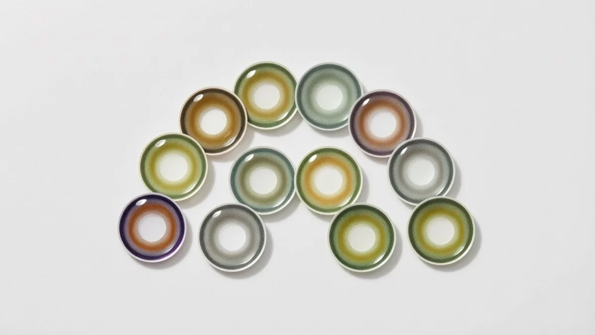
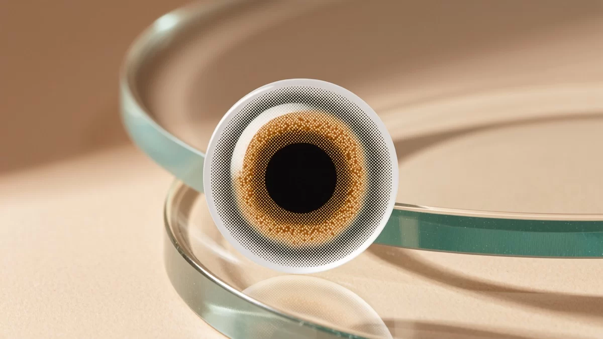
Natural-looking lenses use dot-matrix or multi-tone printing: thousands of tiny dots in two or three blended colors. The dots vary in density, being denser toward the outer edge of the color zone and fading toward the center. This mimics how a real iris actually looks — it’s not a solid disc, it’s a textured, radial pattern with natural variation.
When evaluating samples, hold the lens up and look at the color zone closely. Can you see individual dot texture and a gradient? That’s a good sign. Is the color a flat, even wash? That’s the “fake look” right there.
2. The Limbal Ring: Soft or Sharp?
The limbal ring is the dark outer circle of the color zone, corresponding to the natural border of the iris. It’s the most powerful tool in colored lens design — and the most commonly misused.
- Soft, blended limbal rings make eyes look naturally bigger and defined. They read as “nice eyes,” not “colored lenses.” Most natural-style and enhancement lenses use this approach.
- Sharp, high-contrast limbal rings create the dramatic “doll eye” look popular in some Asian beauty markets and cosplay. Intentionally artificial — and great for that purpose — but the wrong choice if you’re marketing natural looks.
A useful rule when reviewing designs: the softer the transition between the limbal ring and the inner pattern, the more natural the lens will wear.
3. Diameter: Bigger Is Not Always Better
Colored lens diameters typically run from 14.0mm to 14.5mm, and the coloring zone matters more than the overall number.
If the colored zone is too large for the wearer’s visible iris, the lens looks obviously artificial — the color spills past where the real iris would end. If it’s well proportioned, the eye simply looks richer in color and slightly more defined.
For markets that want natural results (Europe, North America, everyday wear), coloring zones that mimic natural iris size win. For markets favoring the enlarged “doll eye” aesthetic (parts of Asia, cosplay), larger coloring zones are expected.
One more point: a 14.2mm lens with a well-designed coloring zone will look more natural than a 14.0mm lens with a poorly designed one. Diameter is only half the story.
4. Color Choice: Blend With the Base, Don’t Cover It
Natural-look lenses aren’t trying to hide the wearer’s eye color completely. They’re designed to blend with it.
This is why honey, hazel, soft green and gray-brown tones dominate the natural category — they work across many base eye colors by adding warmth and depth rather than replacing the iris. Fully opaque colors (vivid blue, violet, white) serve a different purpose: they’re designed to cover completely, for fashion or costume use.
For a brand targeting the natural segment, test your samples on both dark-eyed and light-eyed models. A lens that looks gorgeous on a light-eyed model can look dull or muddy on dark eyes if the opacity isn’t calibrated right. Good manufacturers design for both.
5. Pupil Zone Size: The Overlooked Detail
Every colored lens has a clear central zone so the wearer can see. Its size and edge treatment matter more than most buyers check.
A pupil zone that’s too small can cause vision issues in dim lighting, when the wearer’s natural pupil dilates beyond the clear zone. And a hard, abrupt edge around the pupil zone can be visible to others when the wearer looks to the side. Quality designs give the pupil zone a comfortably generous diameter and a smooth transition into the color area.
When you’re checking samples, this is one of the easiest tests: look at the lens from an angle. Does the clear center blend smoothly into the pattern, or does it look like a punched-out hole?
6. The Printing Method: Sandwich Construction Is the Baseline
This one is about safety as much as looks. Quality colored lenses use sandwich printing — the pigment is sealed between polymer layers so it never touches the eye. Cheap lenses sometimes print ink on the surface, which can irritate the eye and fade quickly.
Sandwich construction also affects appearance: properly encapsulated pigment keeps its color depth and consistency over the lens’s lifetime. Surface-printed lenses fade and can take on a rough texture.
For any serious brand, sandwich printing isn’t optional — it’s the minimum standard, and it’s one of the first things we confirm with buyers evaluating our samples.
Putting It Together: A Quick Sample Checklist
When you’re reviewing colored lens samples, run through this list:
- ✅ Dot-matrix or multi-tone pattern, not solid ink
- ✅ Limbal ring softness matching the intended look (natural vs. doll eye)
- ✅ Coloring zone sized for the target market’s aesthetic
- ✅ Colors tested on both dark and light eyes
- ✅ Smooth, generous pupil zone
- ✅ Sandwich printing confirmed by the manufacturer
- ✅ CE/FDA certification for your target market
Why This Matters for Your Business
Customers can feel the difference between a well-designed and a poorly-designed lens immediately, even if they can’t articulate why. Natural-looking lenses get worn daily, photographed, posted about and repurchased. Fake-looking lenses get one Halloween outing and a refund request.
Design quality is also where smaller brands can beat commodity sellers. Anyone can buy cheap lenses; brands that win are the ones whose products actually look good in real life and in photos — which is increasingly where lenses are sold.
We design our OEM/ODM color patterns around exactly these principles, with low MOQs so new brands can test designs on real wearers before scaling. If you’d like to see sample ranges — from natural enhancement to full fashion — we’re happy to send options for your market.
Contact sales@miomicon.com to request samples and discuss your target look.