
Private Label Contact Lens Packaging: Design Choices That Actually Move Product off the Shelf
Here’s something most brand owners get wrong about contact lens packaging: they spend months perfecting the lens formula, negotiating with OEM suppliers, and building a brand identity — then slap it into a generic blister pack with a label that looks like every other brand on the shelf.
I’ve seen it happen dozens of times. A client comes to us with a fantastic product — great color range, comfortable material, competitive pricing — but their packaging tells a completely different story. The box feels flimsy. The colors are washed out. The typography is generic. And when it sits next to a competitor’s product on a retail shelf (or in an Instagram flat-lay), it loses.
Let’s talk about what actually works in contact lens packaging in 2026, what doesn’t, and where brand owners commonly waste money.
Why Packaging Matters More Than You Think in This Industry
Contact lenses are a medical device. That means your packaging carries more weight than, say, a phone case or a lip gloss. Customers are putting this product in their eyes. The packaging is the first signal of whether they can trust what’s inside.
Research from the packaging industry consistently shows that consumers form a first impression of a product within seven seconds. For contact lenses sold online — which is increasingly how the market works — that impression happens through a product photo. The packaging is the storefront.
For B2B buyers and distributors, packaging quality signals manufacturing quality. I’ve had retail buyers tell me they won’t even open a sample box if the outer packaging looks cheap. That’s not vanity — it’s a heuristic. If you can’t get the box right, what does that say about the lens inside?
The Three Layers That Matter
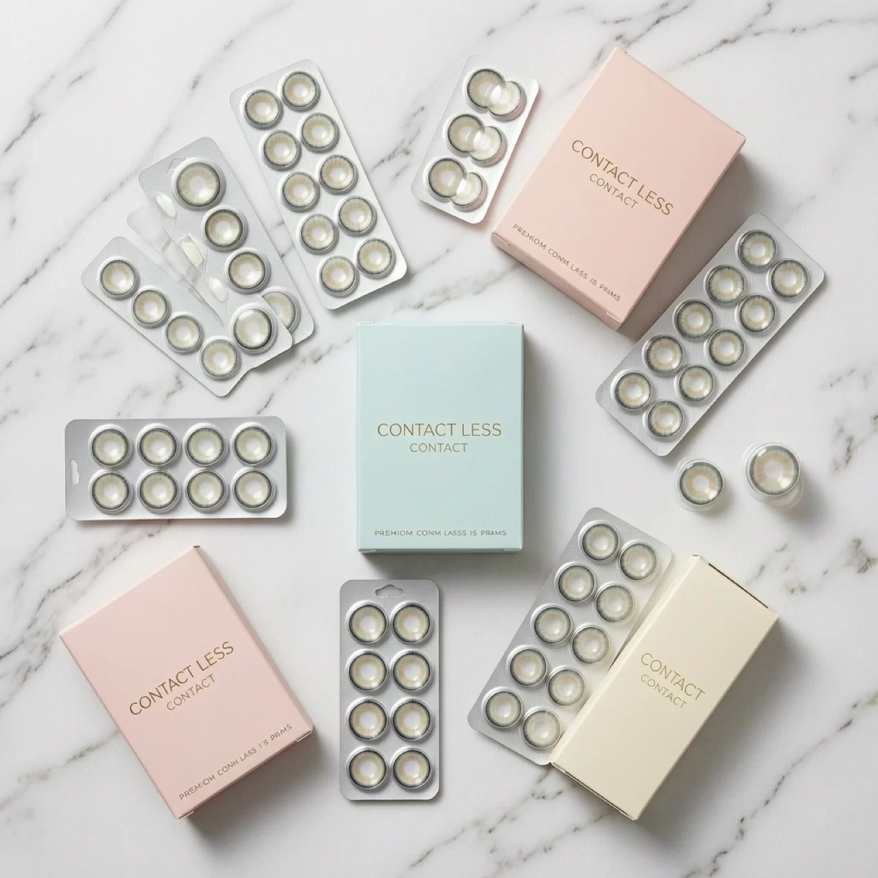
1. The Outer Box (Retail Packaging)
This is your billboard. It needs to do three things:
- Communicate the brand — color palette, logo placement, typography that’s consistent with your website and social media
- Show key specs at a glance — diameter, base curve, water content, replacement cycle. Buyers compare these side by side.
- Pass the shelf test — would this look credible next to Acuvue, Solotica, or Anesthesia?
The most common mistake I see: too much text. Brand owners want to list every certification, every feature, every benefit. The result is a wall of text that nobody reads. Pick three to five key messages and make them prominent. Everything else goes on the back or inside.
Material matters. Matte finishes feel premium. Spot UV on the logo catches light and draws the eye. Soft-touch coatings are more expensive but create a tactile experience that customers remember. For colored lenses targeting the beauty market, this is worth the investment.
2. The Blister Pack (Primary Packaging)
This is what the customer handles every single day. It needs to be functional first, attractive second.
Functional means: easy to open (nobody wants to fumble with a sealed pack when they’re half-asleep getting ready), clearly labeled with the lens parameters, and designed so the lens comes out without tearing or sticking.
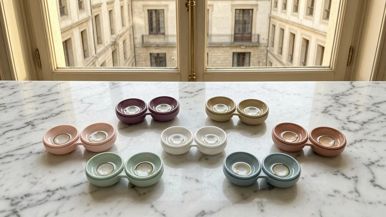
For colored lenses, there’s an opportunity most brands miss: printing the color name and a small color swatch directly on the blister. When someone owns twelve colors (and your target customer probably does), being able to quickly identify which lens is which matters.
The buffer solution in the blister pack also deserves attention. Some brands cut costs here by using basic saline. But the solution affects how the lens feels when first inserted. A customer who puts in a lens that stings or feels dry on day one doesn’t blame the solution — they blame your brand.
3. The Insert Card (Often Ignored, Surprisingly Important)
Most brand owners treat the insert card as an afterthought. It’s a folded piece of paper with instructions nobody reads. Right?
Wrong. The insert card is the only physical touchpoint you have inside the packaging. It’s your chance to:
- Reinforce brand personality (tone of voice, visual style)
- Include a QR code linking to video tutorials or your community
- Print a loyalty card or referral code
- Make the customer feel like they bought something worth the price
I’ve seen brands spend $0.03 extra per insert card on better paper stock and a thoughtful design, and get a measurable lift in repeat purchases. That’s not an opinion — I’ve tracked it.
Where Brand Owners Overspend
Let’s be honest: packaging costs add up, especially when you’re producing small batches. Here’s where I see brands waste money:
Custom-molded trays. Unless you’re selling a premium line at a premium price, a custom-molded plastic tray is overkill. A well-designed cardboard insert holds the blister pack just as well and costs a fraction.
Full-color printing on every surface. You don’t need the inside of the box to be printed. You don’t need the bottom to carry a full pattern. Focus the color budget on the front face and the spine — those are what people see.
Foil stamping everywhere. A little foil goes a long way. One or two foil elements (logo, product name) create the premium effect. Foil-stamping the entire box costs more and actually looks worse — it becomes visually noisy.
Overly complex unboxing. Some brands design packaging that requires multiple steps to open — magnetic closures, ribbon pulls, nested boxes. It looks great in an unboxing video. It’s annoying in real life. Keep it simple.
Where They Underspend
Photography for e-commerce. If your product photos are lit with a phone flashlight on a kitchen table, no amount of packaging design will save you. Budget for professional product photography. The packaging needs to look as good in a photo as it does in hand.
Regulatory compliance design. CE marks, FDA statements, ingredient lists — these are mandatory, and they need to be legible. I’ve seen brands shrink this text to 4pt to save space. That’s a regulatory risk, not a design choice. Build the compliance text into your layout from the start.
Color accuracy on the box. The color swatch printed on your packaging should match the actual lens color. This requires working with your printer on color calibration and doing press proofs. Skipping this step leads to customer complaints (“the color looked different on the box”) and returns.
A Practical Framework for Your Next Packaging Run
If you’re launching a new line or refreshing your packaging, here’s the order I’d suggest:
- Start with the brand. Define your color palette, typography, and visual language before touching any packaging template. If you don’t have a brand guide, create one first.
- Audit the competition. Buy three to five competitor products. Photograph their packaging. Note what works and what doesn’t. Your packaging needs to be visually distinct from all of them.
- Design for the primary use case. Is your product sold mostly online? Prioritize how it looks in product photos. Is it sold in retail? Prioritize shelf presence. These require different design approaches.
- Prototype cheaply. Print mock-ups on a home printer, cut them out, and put your actual blister packs inside. Hold it. Shake it. Put it next to a competitor’s product. You’ll catch problems fast.
- Press proof before full run. Always request a physical press proof from your printer. Screen colors lie. Paper colors lie. The press proof is the only truth.
- Order in stages. If your MOQ allows, order a smaller first run. Test the packaging with real customers. Gather feedback. Then commit to the larger volume.
The Bottom Line
Packaging isn’t decoration. It’s the first product experience your customer has, and for many of them, it’s the reason they choose you over a competitor.
In the contact lens industry — where the product itself is small, technical, and hard to differentiate visually — packaging does a lot of heavy lifting. It communicates quality before the customer ever touches the lens. It builds trust. It creates the unboxing moment that gets shared on social media.
If you’re spending 90% of your budget on the lens and 10% on the packaging, you’ve probably got that ratio backwards. A great lens in bad packaging will struggle. A good lens in great packaging will outperform it every time.
At MIOMI, we work with brand owners on packaging decisions as part of our OEM/ODM service — not because we want to sell you more boxes, but because we’ve seen too many good products fail because of bad packaging. If you’re building a colored contact lens brand and want to talk about packaging strategy, reach out. We’re happy to share what we’ve learned.