Every new colored contact lens brand faces the same exciting, paralyzing moment: the manufacturer sends you the color catalog — hundreds of options — and you need to pick your launch range.
Most founders choose wrong at this step. They pick their personal favorites, or they try to launch with 30 colors and spread their budget thin. Then they discover six months later that three colors carry 80% of their sales.
Here’s how to choose your first range with real logic instead of guesswork.
The Core Principle: Depth Over Breadth
A new brand doesn’t need many colors — it needs the RIGHT colors, well-stocked and well-photographed.
Every color you launch costs money in: inventory, product photography, packaging variants, listing creation and marketing attention. A 30-color launch with thin stock per color loses to a tight 10-color launch with deep stock, great visuals and focused promotion — almost every time.
Ten colors is the sweet spot for most launches: enough to look like a real brand, small enough to execute properly.
The Proven Color Mix Formula
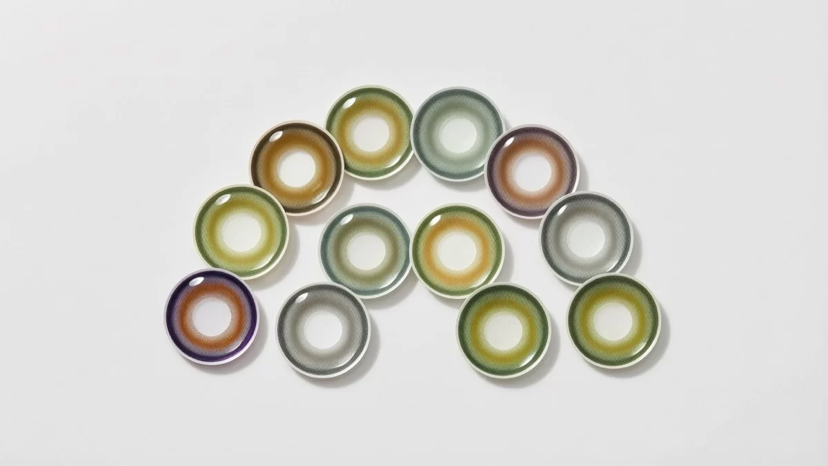
Based on what actually sells across markets, a strong first range looks roughly like this:
4–5 natural/enhancement colors (40–50% of your range):
Honey, hazel, soft green, gray and warm brown tones. These are the everyday colors — the ones customers wear to work, to class, on dates. They drive repeat purchases because they’re worn frequently. In almost every market, natural colors are the volume base.
2–3 fashion/definition colors (25%):
Colors with more presence — deeper greens, icy grays, bright blues with soft limbal rings. These are the “statement but still wearable” colors that perform beautifully on social media and attract the fashion-forward segment.
1–2 bold/occasion colors (15%):
Vivid blue, violet or a striking gray for events, festivals and content creators. These colors are marketing engines — they generate the dramatic before/after content that stops thumbs on social feeds — even if their unit volume is modest.
1 safe “universal” dark tone (10%):
A rich brown or black enhancement that works across all eye colors and skin tones. It’s your “can’t go wrong” option and often a quiet bestseller in diverse markets.
What Your Specific Market Changes
The formula above is the skeleton; your market supplies the flesh:
- Middle East: lean heavier into gray and green enhancement tones — regional favorites — and ensure opacity that shows on dark eyes
- Southeast Asia: include at least one “doll-eye” style with a stronger limbal ring; pastel and pink-toned fashion colors also perform well
- Europe/North America: natural subtlety wins; overtly dramatic colors are niche. Prioritize realistic patterns over saturated ones
- Latin America: honey and warm tones shine; bold colors have a real festival-driven audience
- Africa: high-opacity colors that show clearly on dark eyes are essential — many ranges fail here by shipping colors designed for light eyes
The Dark-Eye Rule
Here’s the mistake that quietly kills brands: choosing colors based on how they look in catalog photos (shot on light-eyed models).
If your market is predominantly dark-eyed — which most of the world is — every color in your range must perform on dark eyes. Test samples on dark-eyed wearers, not just light-eyed ones. A color that’s gorgeous on a blue-eyed model but invisible on brown eyes is a dead SKU for most of the world.
Practical Steps Before You Commit
- Order sample cards of your shortlist (aim for 15–20 candidates, then cut to 10)
- Test-wear each on your target eye colors in natural daylight, indoor light and on camera
- Photograph them yourself the way your customers will see them — phone photos, real lighting
- Ask 10 people in your target market which they’d buy; their answers will surprise you
- Check your competitor’s bestsellers (their “top sellers” section is free market research)
- Cut ruthlessly — if two colors are nearly identical, keep one
Leave Room to Evolve
Your first range is a learning device as much as a product line. Track which colors get viewed, tried and bought. After 3–6 months, you’ll have real data: usually 2–3 colors overperform and 2–3 underperform. Then you refresh — retire the weak ones, deepen stock in the winners, and test 2–3 new candidates.
That’s how strong brands build ranges: not by launching everything at once, but by iterating toward what their specific customers actually buy.
The Bottom Line
Your first 10 colors should be a strategic portfolio, not a personal wishlist: natural colors for volume, fashion colors for identity, bold colors for marketing, and every single one proven on the eye colors your market actually has.
We help new brands with exactly this process — sample cards, test-wear guidance and market-specific color recommendations, with low MOQs so your first range doesn’t require a huge inventory bet.
Ready to build your launch range? Contact sales@miomicon.com and we’ll help you shortlist colors for your market.